Second year information design course. Focused on art direction, graphic design, interaction design, UX and copywriting. The goal was to develop a visual identity for a cultural arts client.
Figma
Photoshop
Illustrator
After Effects
This 5-week project focused on developing a visual identity and microsite experience for Strange Sounds From Beyond, an Amsterdam-based music festival, through graphic experimentation to deeply explore syntactic and semantic design. The festival highlights unorthodox, lesser-known musicians, exploring various cultures and soundscapes through a mix of traditional and alternative music. This study focuses mainly on the art direction portion of the project.
Chris Thomas
Bryan Shum
Kasey Le
Edwin Ma
While not the primary designer, I played a pivotal role in organizing and guiding our team of four talented designers throughout the project. We collectively dedicated weeks to exploring and iterating, ultimately converging on a versatile art direction. My contributions included shaping final posters, graphic assets, web elements (excluding motion graphics), and content writing.
As part of a team, we were provided with design precedents and tasked with extracting key qualities and principles to integrate into our work. The challenge lay in learning from these precedents while maintaining my unique design identity, avoiding the difficulty of simply replicating their visual styles. Here’s how my own process looked:
I started by analyzing the work of my given precedent, to identify recurring themes, such as their use of high-contrast color overlays used to stitch visual planes between image and type, creating visual intensity within a limited color palette. To gain a broader understanding, I researched how other contemporary designers utilized these qualities through image grouping, enriching my perspective and preventing a narrow, imitative approach.
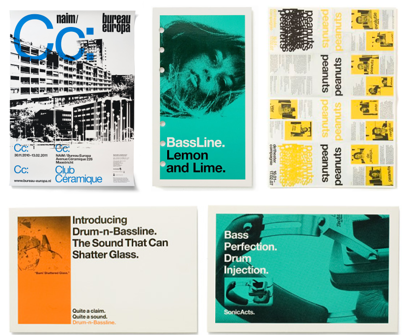
Colour overlay in given precedents' work.
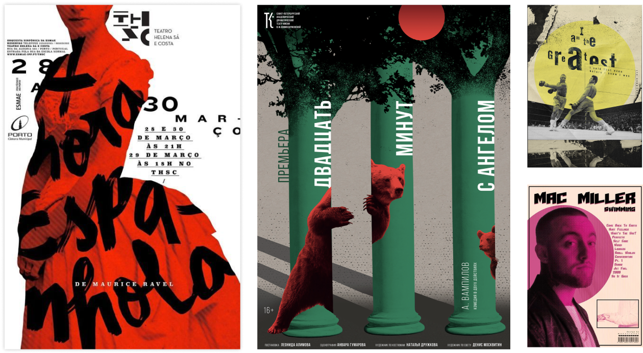
Colour overlay in contemporary precedents' work.
Applying these extracted qualities to my own work, I iterated over 20 poster designs. The key was focusing on the desired outcome from using each quality, rather than the quality itself. For example, focusing on creating depth, hiding and highlighting elements through overlayering of elements, rather than simply placing image and text arbitrarily on top of each other. This lateral design process allowed me to explore various approaches and refine my ideas continuously.
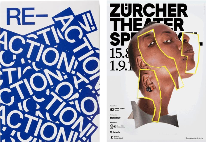
Depth through layering in precedents’ work.
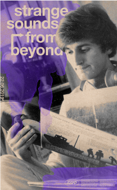
My own exploration.
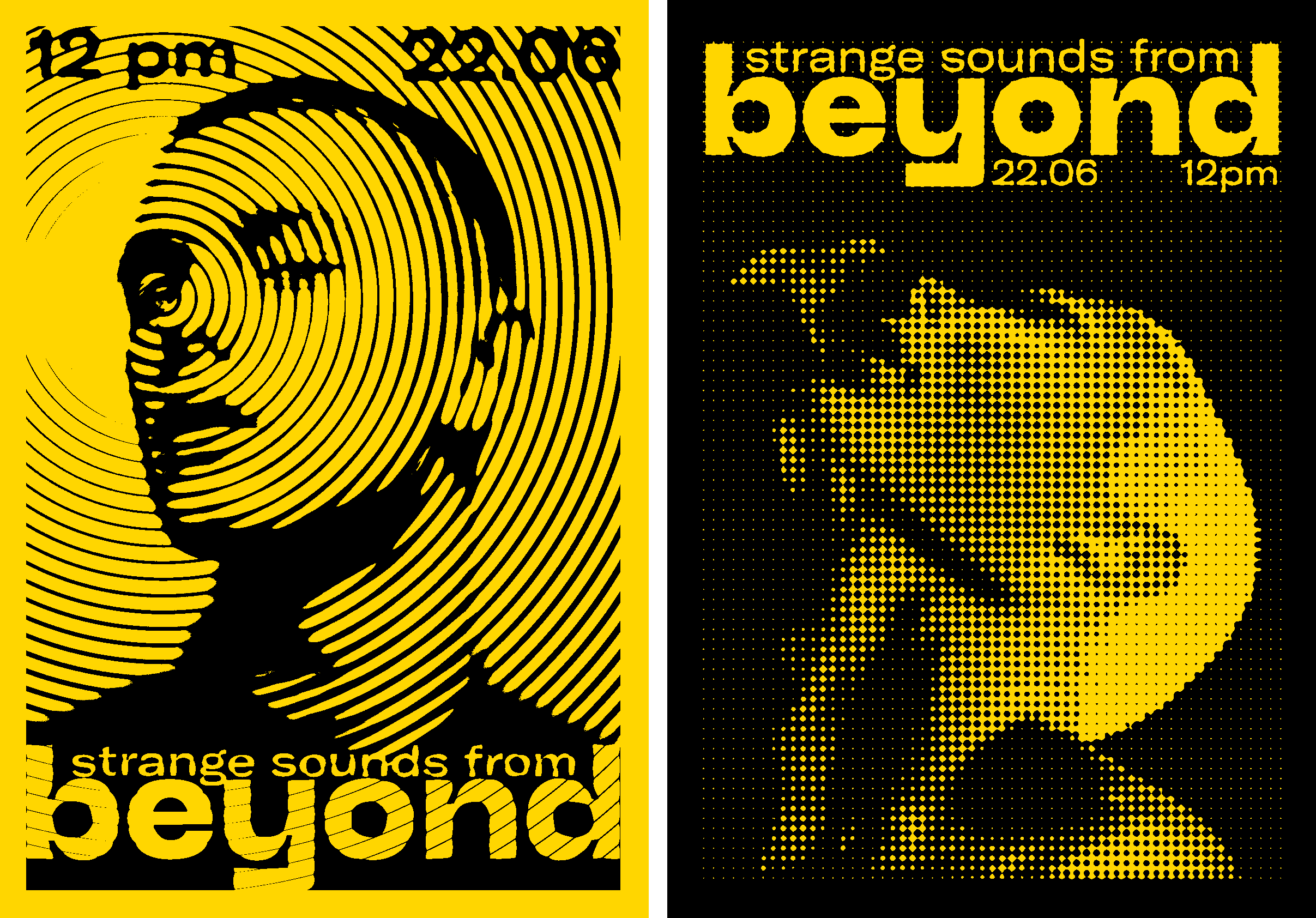
From each iteration, I selected the most effective elements, converging them into a final poster design. This ”almost final” piece visually differed from the precedents but incorporated multiple design qualities and principles derived from them. The final phase involved synthesizing individual ideas into a refined visual identity, ensuring the output was cohesive yet innovative, bouncing off each group mates’ iterations to create a unified art direction that could be later translated to different mediums.
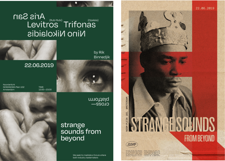
2 of my "almost final" posters.
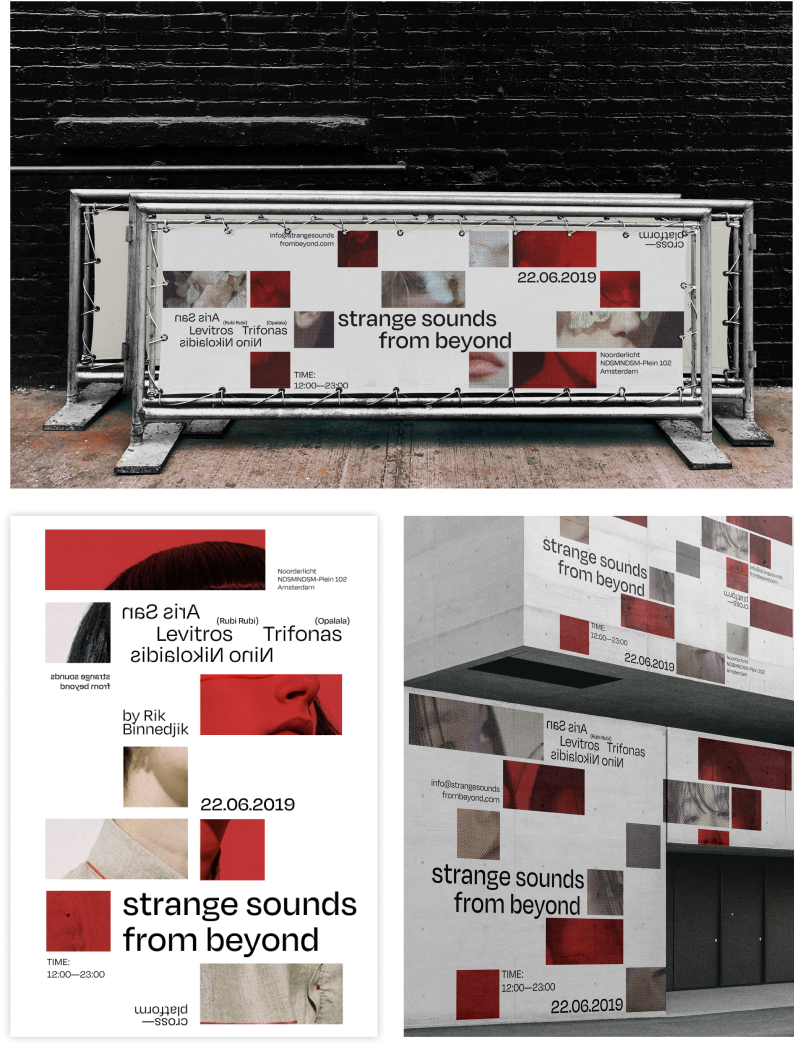
1 of 3 final group art directions.
This project taught me to delve deeper than aesthetics, focusing on why visual elements are effective. I learned to extract and adapt key qualities from accomplished designers, emphasizing outcomes rather than mere styles. This approach is now fundamental to my design process, enhancing my academic and freelance work. By grounding my designs in solid rationale, I ensure they are unique and impactful. This project fundamentally shaped my approach, highlighting the importance of intentionality in every creative decision.