Second year entrepreneurship course. Focused on problem identification, solution development, UI design and business model. The goal was to tackle one of UN's 17 global goals, but with a narrower scope.
Max Chung
Kaemon Daver
Wang Yui Chan
Victoria Xi
This Business and Entrepreneurship group project aimed to develop a business idea addressing one of the UN's 17 global goals, in which we focused on Vancouver's road safety issue: impaired driving. Research revealed that a BAC over 0.04 g/dl significantly increases accident risk. However, factors like drink alcohol concentration, user's sex, weight, and food intake can complicate this standard.
Figma
Photoshop
As the sole visual designer in the group, I was tasked with developing an app mockup that could bring the group’s proposed solution to life. We collectively did research into the problem and developed a theoretical solution and business plan. My primary role in the group as the product designer was to carefully craft a product that could address these concerns efficiently with a strong focus on customer-centric user experience design.
An overview of the project as a whole.
User interviews highlighted the need for quick usability during social outings, so when working on wireframes, I prioritized swift access to essential features—BAC%, sobriety timer, and drink logging—to minimize phone usage.
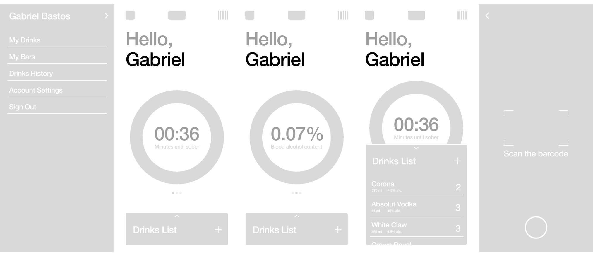
Initial wireframes with a focus on quick app usage. Home screen has a timer as well as a percentage, while additional features are all within one click/swipe away.
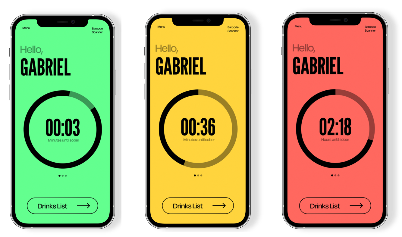
Low-fidelity mock-ups explored visual design elements, emphasizing color coding to achieve the team’s end goal. A quick round of user testing validated the effectiveness of clear and purposeful colors for quicker app navigation, which brought about my decision of the “traffic light” colour palette.
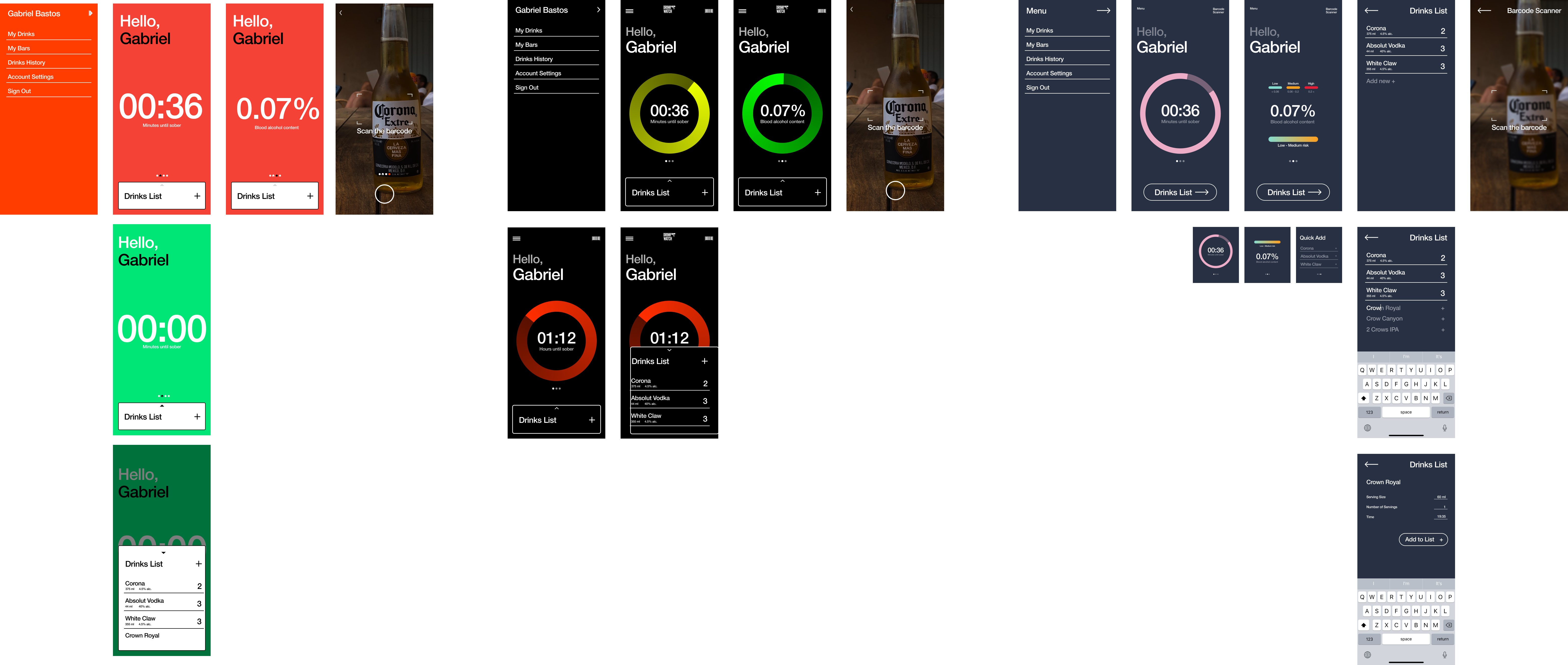
3 variations of the interface, ranging from a highly functional interface with low visual appeal, to a more expressive but almost arbitrary use of colour.
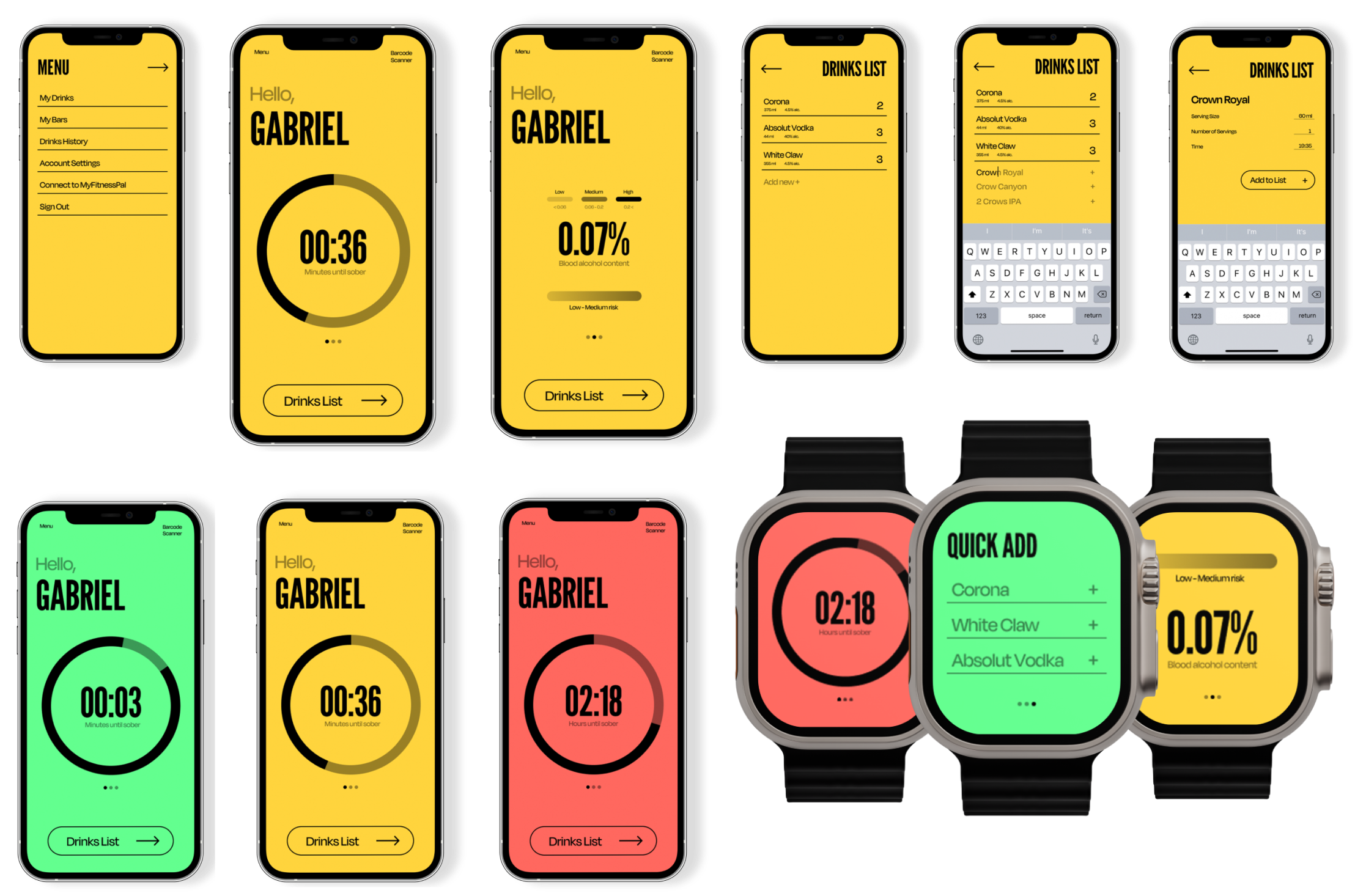
Combining the use of colour of my most functional mock-up with some of the visual elements of the more expressive designs allowed for a highly effective interface while still being visually balanced. Choosing the font pairing was the final touch. Using a bold condensed gothic alongside a modern display sans made the design pop, setting a clear hierarchy between visual elements.
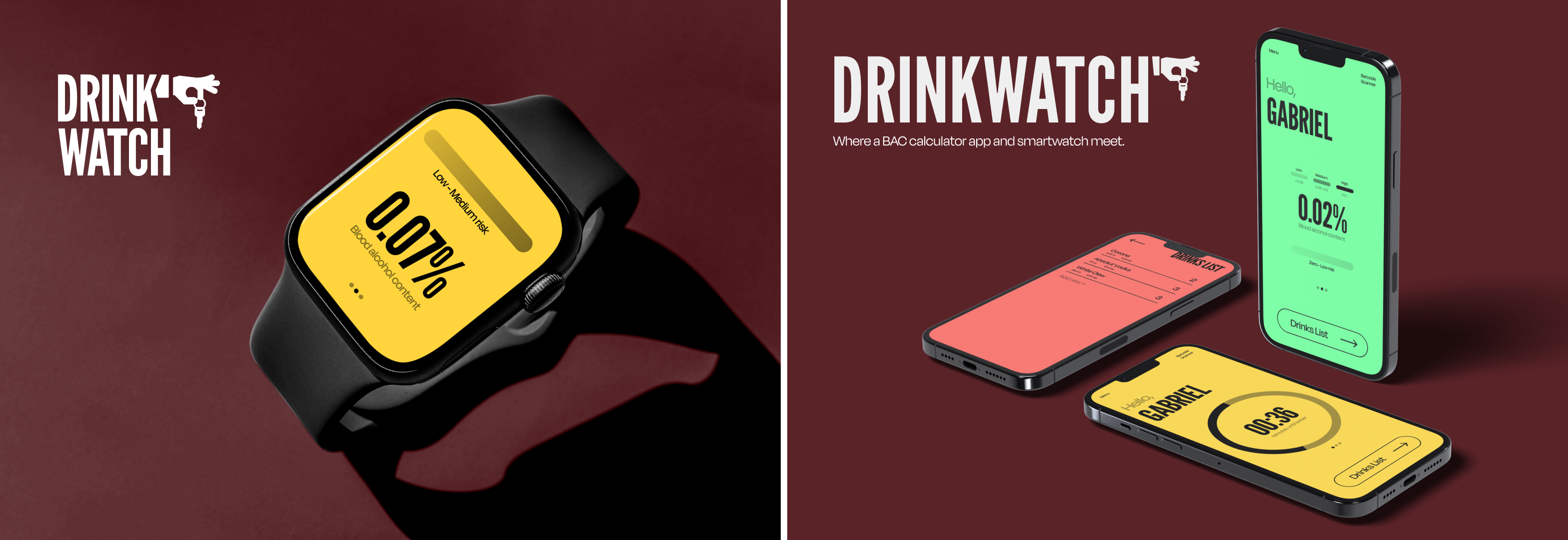
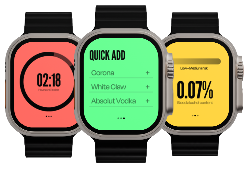
After a second round of user interviews, the need for a smartwatch option emerged for quicker access without relying on a phone. Adapting the interface for a smaller screen posed a challenge, but effective use of color and a prominent timer aided in communicating necessary information. When it came to user input, simplifying drink logging was addressed with a quick add feature, enabling easy logging from a list of recent drinks with just one touch.
Constructive feedback from the teaching team centered on liability and accuracy concerns. To address these, future iterations would emphasize the app's role as a tracking tool rather than a definitive measure of sobriety. Secondly, potentially incorporating cognitive tasks or game-like activities could enhance accuracy by assessing user reaction times.
Some mockups of the final product.
